
Customer Portal Branding & Style Customization
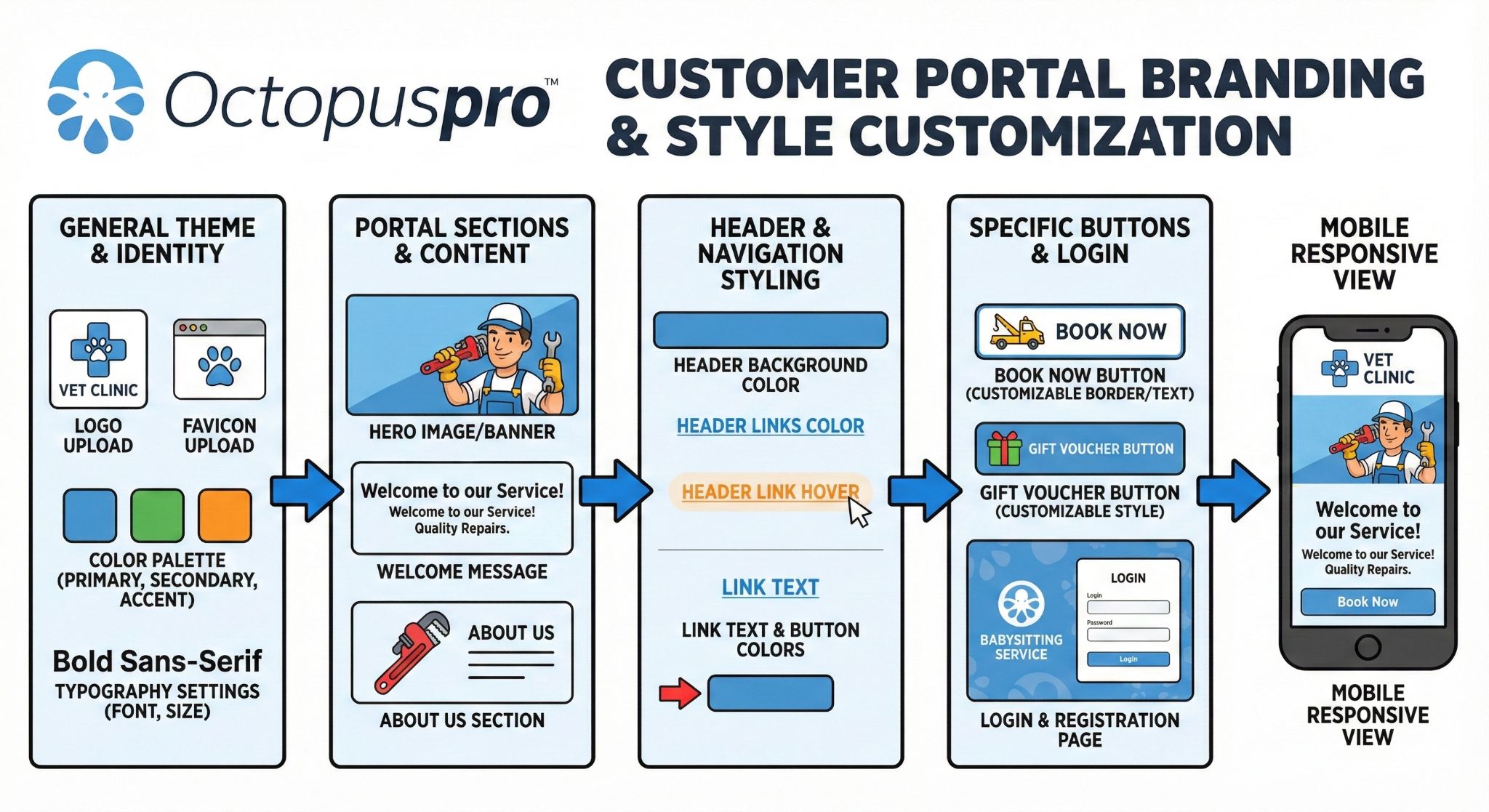
Your OctopusPro Customer Portal is a customer-facing booking and self-service experience. Customizing its branding improves trust, creates a consistent customer experience across your website and portal, and can increase online booking conversions.
From Settings > Customer Portal > Branding & Style, you can customize your portal’s visual identity including logos, favicon, homepage background images, header styling, link colors, and button styling.
Best practices before you start
- Use high contrast (especially for header links and buttons) to keep text readable on desktop and mobile.
- Optimize images for fast loading (compressed JPG/PNG).
- Preview on mobile after changes (background images may crop differently on smaller screens).
- Consider white-labelling your portal URL for a more branded experience: Customer Portal URL White Labelling and Customization.
Table of contents
- Set a favicon (browser tab icon)
- Set the homepage logo (top of portal homepage)
- Set a homepage background image or background gallery
- Optional: enable a dark overlay on the homepage background
- Add welcome text and intro text on the homepage
- Add your logo to the portal header
- Set the header background color
- Set header link colors + hover color
- Set internal link text color
- Set portal buttons & arrows color
- Customize and embed the Book Now button
- Customize and embed the Gift Voucher button
- Customize the Login & Registration page
- Troubleshooting
Set a favicon (browser tab icon)
A favicon is the small icon shown in browser tabs, bookmarks, and saved shortcuts. It helps customers identify your portal when they have multiple tabs open and strengthens branding.
To set your portal favicon:
- Go to Settings > Customer Portal > Branding & Style.
- Upload your icon under Favicon.
- Click Save and refresh the portal (favicons may be cached by your browser).

Favicon tips:
- Use a simple square icon (often your logo mark works best).
- Because favicons are small, avoid detailed artwork.
- If you need to generate multiple favicon sizes quickly, you can use: RealFaviconGenerator.
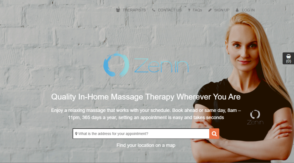
Set the homepage logo (top of portal homepage)
The homepage logo appears at the top center of your portal homepage (landing page). This is separate from the header logo used on categories and service pages.
To upload a homepage logo:
- Go to Settings > Customer Portal > Branding & Style.
- Upload your logo under Homepage logo.
- Click Save and preview your portal homepage.
Recommended max homepage logo width: 450px
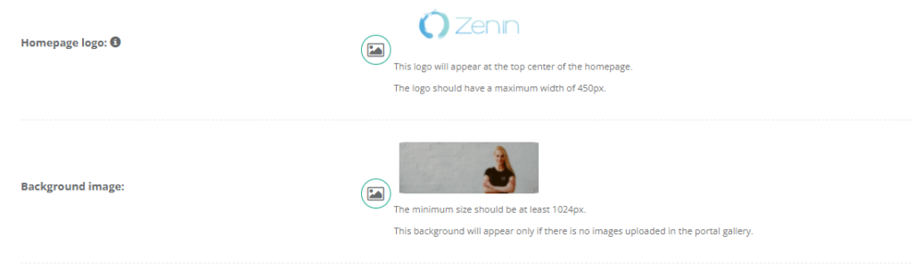
Set a homepage background image or background gallery
You can display either:
- Background image: one static image on the portal homepage, or
- Background gallery: multiple images that automatically fade/transition.
To set a background image or gallery:
- Go to Settings > Customer Portal > Branding & Style.
- Upload a single image under Background image, or upload multiple images under Background gallery.
- Click Save and preview your portal homepage.
Note: The minimum recommended size is at least 1024px wide.
Important: If you upload images to the background gallery, the single background image is typically used only when the gallery is empty.
Optional: enable a dark overlay on the homepage background
If your background is bright or busy, enable the dark overlay to improve text readability (welcome text, intro text, and search/booking elements).
- Go to Settings > Customer Portal > Branding & Style.
- Enable Display a dark layer over background image?
- Click Save and preview the homepage.

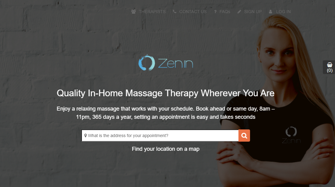
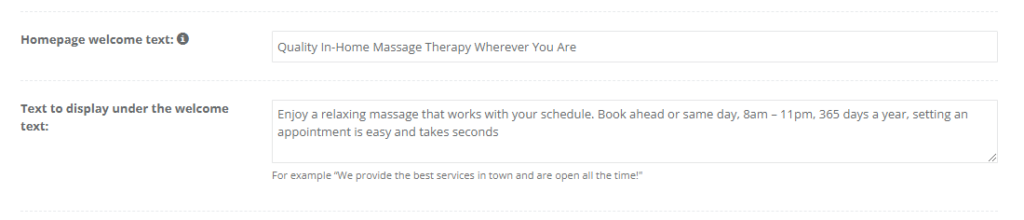
Add welcome text and intro text on the homepage
Your welcome message is the first thing customers see. Use it to communicate what you do, who you serve, and what the customer should do next.
To add homepage text:
- Go to Settings > Customer Portal > Branding & Style.
- Enter your Homepage welcome text (headline).
- Enter the Text to display under the welcome text (supporting message / CTA).
- Click Save and preview the portal homepage.
Examples
- Home services: “Book a licensed technician in minutes” / “Choose a service, pick a time, and we’ll confirm instantly.”
- Automotive: “Trusted repairs, fast turnaround” / “Schedule your service now and get back on the road.”
- Wellness: “In-home appointments that fit your schedule” / “Book ahead or same-day—appointments take seconds.”
Customer Portal header (navigation)
A header is visible on your categories and service pages. You can brand it with your logo and colors so navigation feels consistent and professional.
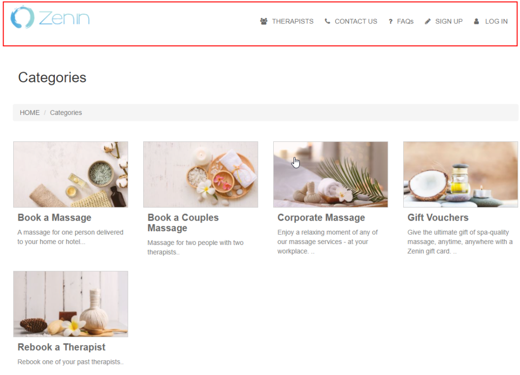
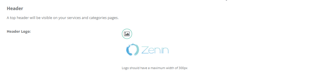
Add your logo to the portal header
This logo appears in the top left of the portal header on categories and service pages.
- Go to Settings > Customer Portal > Branding & Style.
- Upload your logo under Header logo.
- Click Save and refresh your portal.
Recommended max header logo width: 300px
Set the header background color
Choose a header background that matches your brand and keeps header links readable.
- Go to Settings > Customer Portal > Branding & Style.
- Select Header background color.
- Click Save and preview category/service pages.

Set header link colors + hover color
These settings control navigation link colors in the portal header (and help customers clearly identify clickable items).
Header link text color
- Go to Settings > Customer Portal > Branding & Style.
- Set Header links text color.
- Click Save and check contrast on category/service pages.

Header link hover color
- Set Header links text hover color.
- Pick a different color from the normal link color so hover feedback is clear.
- Click Save and test by hovering over header links.

Set internal link text color
This controls the color of link text across your portal internal pages (for example: category links, service links, breadcrumbs, and other clickable text links).
- Go to Settings > Customer Portal > Branding & Style.
- Set Link text color in internal pages.
- Click Save and review multiple portal pages for readability.

Set portal buttons & arrows color
This setting controls action buttons and arrow UI elements across your portal (including key steps in the booking flow).
- Go to Settings > Customer Portal > Branding & Style.
- Set Buttons and arrows color.
- Click Save and test a booking flow to confirm button text remains readable.

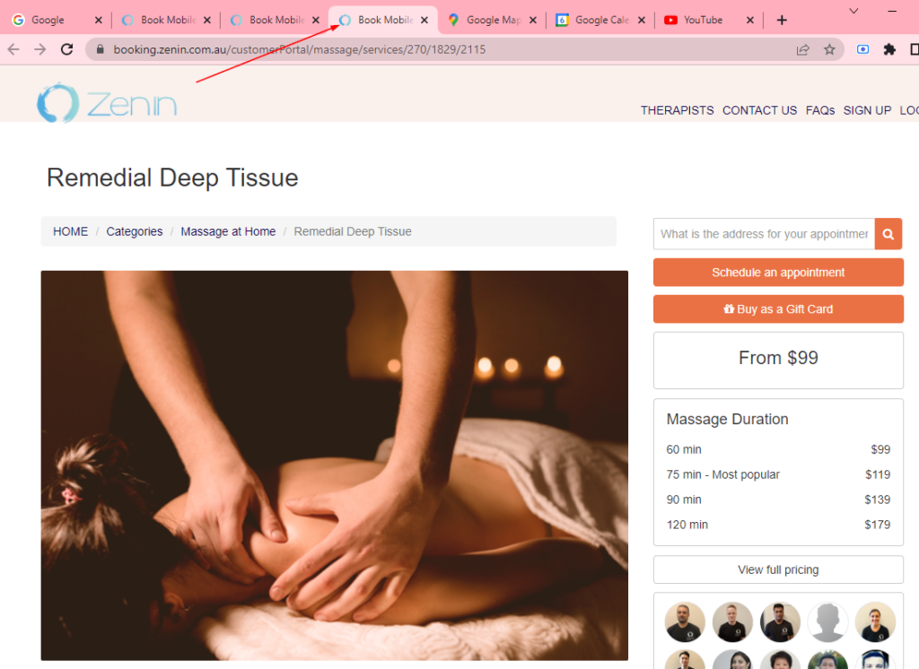
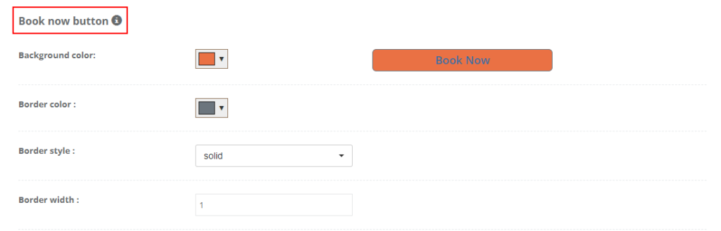
Customize and embed the Book Now button
The Book Now button is designed to be embedded on your website. When clicked, it opens the booking flow (typically in a popup), allowing customers to start booking directly from your site.
For a full guide on enabling online bookings through your website, see: Enable Online Bookings Through Your Website.
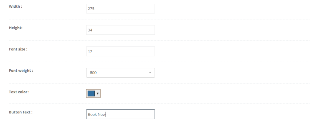
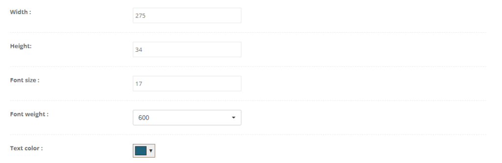
To customize the Book Now button style:
- Go to Settings > Customer Portal > Branding & Style.
- Scroll to the Book now button section.
- Customize the button (background color, border color/style/width, border radius, width/height, font size/weight, text color, and button text).
- Click Save.
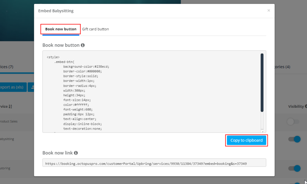
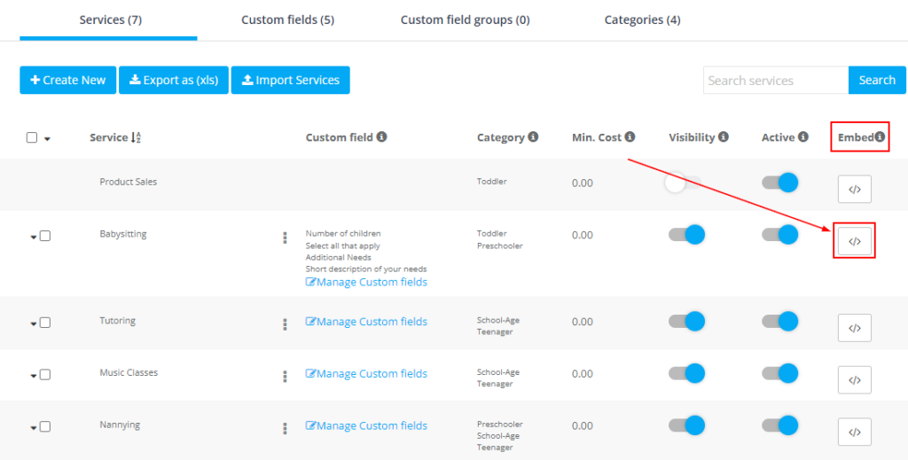
To copy the Book Now embed code:
- Go to Settings > Services Settings > Services.
- Find the service you want to embed and click the Embed icon.
- Open the Book now button tab.
- Click Copy to clipboard, then paste the code into your website HTML.

Common use cases:
- Add a “Book Now” CTA on your homepage hero section.
- Embed a button on each service page (one per service).
- Add a booking CTA to your contact page or footer.
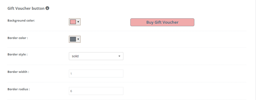
Customize and embed the Gift Voucher button
The Gift Voucher button can be embedded on your website so customers can purchase gift vouchers directly through your portal.
To customize the Gift Voucher button style:
- Go to Settings > Customer Portal > Branding & Style.
- Scroll to the Gift Voucher button section.
- Customize the button styling (background, border, radius, size, font styling, and button text).
- Click Save.
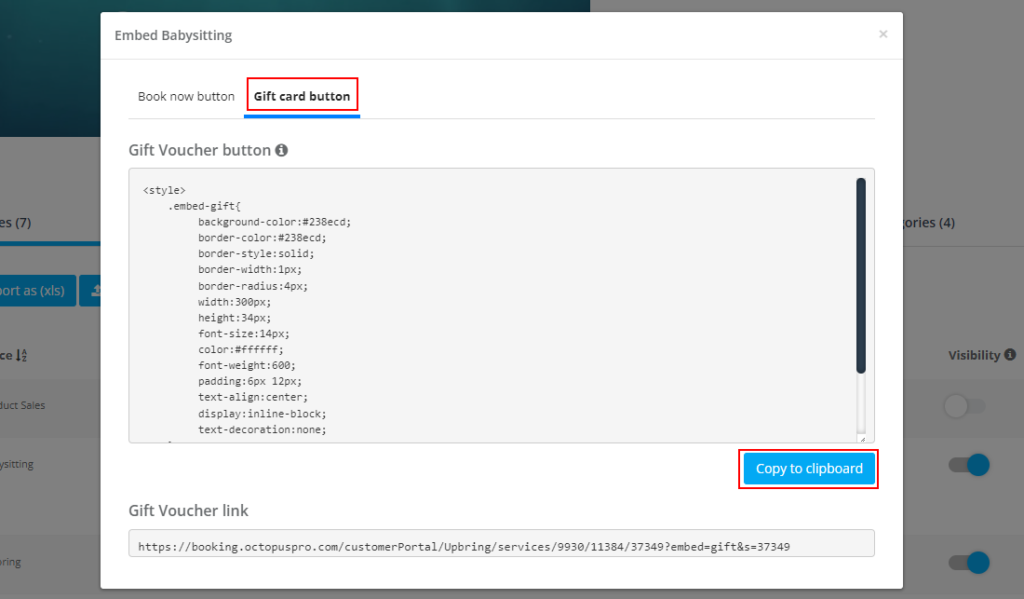
To copy the Gift Voucher embed code:
- Go to Settings > Services Settings > Services.
- Click the Embed icon for the relevant service.
- Open the Gift card button tab.
- Click Copy to clipboard and paste the code into your website.
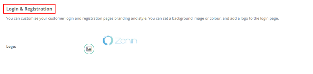
Customize the Login & Registration page
You can brand the login and registration pages by setting a background image or color and adding a logo. This screen may be used by customers, fieldworkers, and admin users depending on how they access your portal.
To customize the login page:
- Go to Settings > Customer Portal > Branding & Style.
- Scroll to Login & Registration.
- Upload your Logo and configure background options (if available in your account).
- Click Save, then preview in an incognito/private window to avoid cached assets.

Troubleshooting
- Branding changes don’t show: hard refresh (Ctrl/Cmd + Shift + R) or open the portal in an incognito/private window.
- Favicon didn’t update: browsers often cache favicons longer—try a different browser or clear cache.
- Welcome text is hard to read: enable the dark overlay and/or choose higher-contrast colors.
- Buttons don’t look right on mobile: reduce button width and test again (responsive layouts can wrap elements).
Optional enhancement: you can embed YouTube videos on your portal homepage (welcome video, testimonials, or how-it-works). Embed YouTube Videos on Your Customer Portal Homepage.
To stay updated, please subscribe to our YouTube channel.