
Forms & Checklists Field Types (Form Elements)
Forms & Checklists in OctopusPro let you collect structured information at important stages of a booking or job, such as booking creation, check-in, check-out, inspections, compliance checks, customer follow-up, and job completion. Each form is made up of fields (also called form elements) that capture a specific type of input, such as dates, times, short answers, longer notes, single-select choices, multi-select choices, or photo evidence.
Choosing the right field type helps you collect cleaner data, reduce admin follow-up, improve consistency across your team, and make forms easier to complete on both desktop and mobile.

On this page
- What are field types?
- How to create a new field
- Field types explained
- Make a field mandatory
- Request photo uploads
- Make photo uploads mandatory
- Edit or delete fields
- Best practices
- Related guides
What are field types?
A field type controls how users enter information into a form. For example, users may select a date from a calendar, choose one option from a dropdown, select multiple options from a list, type a short answer, write detailed notes, or upload photos.
Using the correct field type improves usability and data accuracy. For example:
- Use a Date Picker for dates instead of free typing.
- Use a Time Picker for time values instead of manual input.
- Use a Dropdown, Radio Button, or Button Group when users must choose one option.
- Use a List or Checkbox when users may need to select multiple options.
- Use a Text Field for short answers and a Text Box for longer notes.
How to create a new field
To add a new field to a form or checklist:
- Go to Settings > General Settings > Forms & Checklists.
- Create a new form/checklist or edit an existing one.
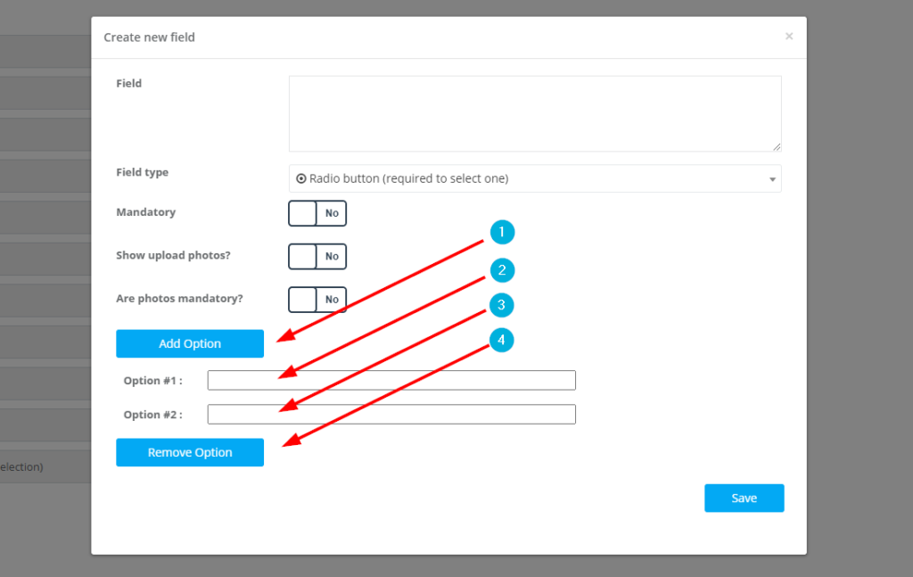
- Under Form Elements, click + Create new field.
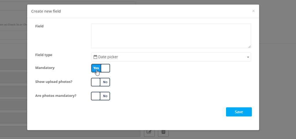
- Enter the Field name. This can be a question, instruction, or label.
- Select the required Field type.
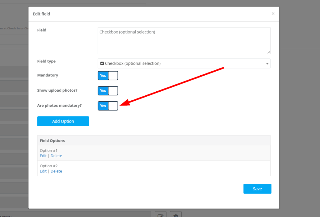
- If needed, configure options such as Mandatory, Show upload photos?, and Are photos mandatory?.
- Click Save.

The available field types are: Date Picker, Time Picker, Text Box (multi-line), Text Field (one line), (+/-) Button, Toggle, Dropdown, Radio Button, Button Group, List, and Checkbox.
Field types explained
Date Picker
Best for: selecting a date from a calendar popup.
Common uses: inspection date, preferred service date, incident date, next service date.


Time Picker
Best for: selecting a time from a time picker popup.
Common uses: arrival time, start time, completion time, access window.


Text Box (Multi-line)
Best for: longer notes, descriptions, comments, and detailed answers.
Common uses: access instructions, work completed notes, issue descriptions, customer comments.


Text Field (One line)
Best for: short answers entered on a single line.
Common uses: serial number, asset ID, gate code, room number, short reference.


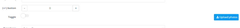
(+/-) Button
Best for: numeric quantities where users need to quickly add or subtract a value.
Common uses: number of rooms, number of items, quantity of units, number of defects found.
This field starts from 0 and only accepts positive numbers.


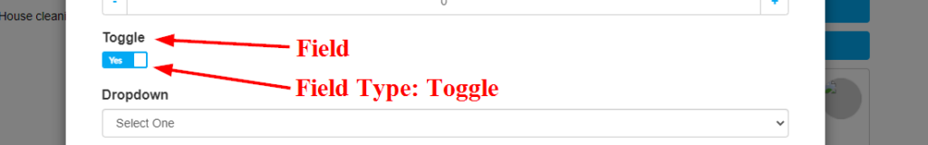
Toggle
Best for: yes/no or on/off answers.
Common uses: customer present, access available, issue resolved, safety check passed.
The default value is No. Clicking the toggle changes it to Yes.

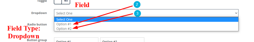
Dropdown
Best for: selecting one option from a longer list.
Common uses: service outcome, issue category, property type, reason code.
Users can select only one option from the dropdown. Admin users can add choices using Add Option and remove the last choice using Remove Option.

Radio Button
Best for: selecting one option when you want all choices visible.
Common uses: condition rating, yes/no/na choice, priority level.
If a user selects another option, the previously selected option is automatically deselected.

Button Group
Best for: single-select answers using larger, tap-friendly buttons.
Common uses: pass/fail, yes/no/na, before/during/after, short category choices.
This field works similarly to a radio button, but the choices appear as separate boxes and are best used with short option labels.
List
Best for: showing all options in one visible list where users may select more than one option.
Common uses: services completed, issues found, items included, tasks completed.
This field is useful when users need to scan several choices without opening a dropdown. Selected options are highlighted.
Checkbox
Best for: selecting multiple options independently.
Common uses: completed tasks, hazards present, materials used, add-ons selected.
Each checkbox is separate, so users can tick one, several, or none of the available options.
Make a field mandatory
Use the Mandatory option when a field must be completed before the user can continue. This is useful for critical booking details, compliance questions, site safety checks, or required evidence.
Request photo uploads
If you need users to attach photos while filling out a field, enable Show upload photos?. This is useful for before/after evidence, damage reports, site condition photos, or proof of work.
Users can upload a single photo or multiple photos, depending on what they need to provide.


Make photo uploads mandatory
If photos must be provided before the form can be submitted, enable Are photos mandatory?. This is especially useful when you need compulsory photo evidence, such as before/after images, vehicle condition photos, damage documentation, or compliance proof.
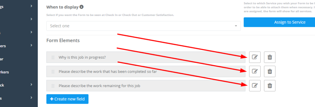
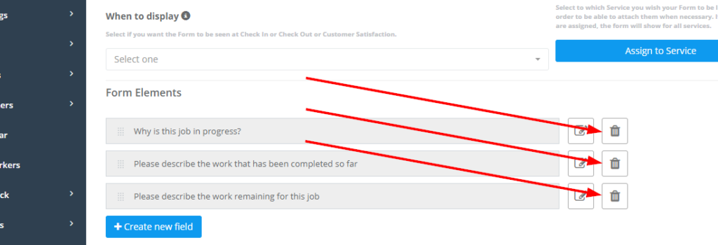
Edit or delete fields
You can edit or delete existing form elements from the Add/Edit Form page.
- Use the Edit icon to update the field label, field type, options, or rules.
- Use the Delete icon to remove the field from the form.
Best practices
- Use clear field labels: write questions or instructions that are easy to understand.
- Use structured fields where possible: dropdowns, radio buttons, button groups, lists, and checkboxes improve consistency compared with free text.
- Use mandatory fields carefully: make important questions required, but avoid adding too many mandatory fields unless they are genuinely necessary.
- Use photo uploads when proof matters: before/after images, inspections, defects, damage, and compliance steps.
- Use button groups or toggles for mobile-friendly yes/no choices: they are faster to complete on-site.
- Keep option labels consistent across forms: for example, always use the same wording for pass/fail or yes/no/na choices.
Related guides
- Forms & Checklists Introduction
- Forms & Checklists Setup
- Using Forms & Checklists
- Forms & Checklists Use Cases
- Collect Customer Signatures
To stay updated, please subscribe to our YouTube channel.